Designing a Tablet UI
Sun, Mar 6, 2016
Read in 3 minutes
I failed today.
I failed today.
I failed a project for my Android Developer Nanodegree at Udacity. My app looked good on phones, but it only functioned in landscape mode on tablets.
Per the project rubric, the app was supposed to function in both portrait and landscape on both tablets and phones. Thus, my app did not “meet expectations.”
I spent a few hours this afternoon fixing this mistake, and I gained some valuable insights along the way.
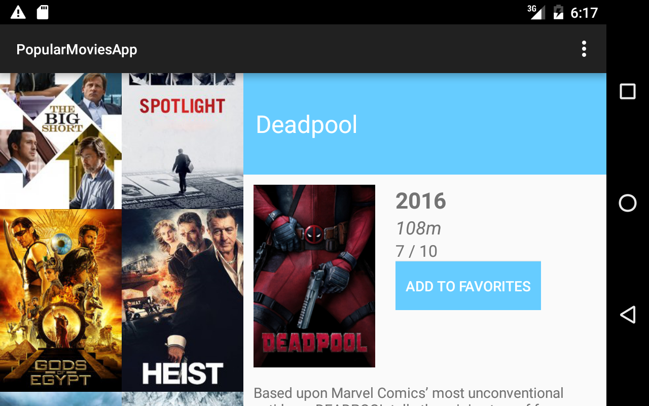
For context, the app is a movie app that displays a list of movie posters from an API and allows you to select one to display details about that movie. On phones, the list of movies takes up the full screen, and selecting a movie poster replaces the list fragment with the movie detail fragment. On a tablet, the result is a master-detail layout with the list of movies on the left and the movie details on the right. In landscape, each view takes up about half of the screen. Landscape mode on tablet
When thinking about portrait mode on tablets, I realized neither option would work. Having each view take up the whole screen would not make good use of the real estate afforded by a tablet. However, splitting the screen in half vertically would result in two very skinny views — also not ideal.
My solution was to confine the list fragment to a smaller percentage of the screen width in portrait mode on tablets. How I accomplished this was by using a dimension resource defined in multiple files:
<dimen name=”tablet_left_content_width”>340dp</dimen>
The line above is defined in src/main/res/values/dimens-sw600dp-land.xml. Let’s break that down:
- dimens: Dimension resources, usually used when you want to define one layout dimension at different sizes across different devices.
- sw600dp: This part of the filename indicates that the file will be used for devices with a “Smallest Width” of 600dp or greater. A good example device in this class is the Nexus 7 at 961 x 600 dp. It is often useful in Android development to group resources into buckets based on screen widths in this manner.
- land: This part is short for “landscape.” This file will be used on devices that are currently in landscape orientation. Android Activities and Fragments get recreated upon orientation change, so the layout will update accordingly.
Putting this all together, the file defines dimension values that are used in medium-sized tablets when they are in landscape mode. In my particular case, I am using a Nexus 7 for testing this app. The movie posters I’m displaying are 170dp wide, so the 340dp width in landscape on tablets means it will show 2 columns of movie posters.
On the same tablet, I wanted to show one column of movie posters when in portrait mode. Using the knowledge of layout folders and their usage, I added the following to res/values/dimens-sw600dp.xml:
<dimen name=”tablet_left_content_width”>170dp</dimen>
Voila! One column of movie posters: Portrait mode on tablet
I hope this has been helpful. Designing for tablets can be tricky, but it can also be enjoyable and rewarding! If you want to see more of this project, it’s on GitHub.